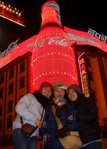
Coke in China

Great submission line on Fark. “China to Coca-Cola: Bite our wax tadpoles.” The story, via AJC:
Chinese authorities rejected Wednesday Coca-Cola Co.’s. $2.4 billion bid for Huiyuan Juice Group, a setback for the Atlanta beverage giant’s expansion plans in a fast-growing Chinese market.
China’s Ministry of Commerce said the deal would have concentrated too much power in one company, hurting competition and raising prices for consumers.
“We are disappointed, but we also respect the MOC’s decision,” Coca-Cola President and CEO Muhtar Kent said in a statement.
“We were looking forward to working with the excellent Huiyuan team to stimulate new growth for the Huiyuan brand.”
The Huiyuan bid, announced in September, was a high-profile test for a new Chinese anti-monopoly law that took effect last August. It would have been the biggest foreign acquisition of a Chinese company.
But why “bite the wax tadpole?” That’s an old marketing story from Coca-Cola history:
When Coca-Cola was first sold in China in 1927, it was obvious to the Coke employees in China that the Coca-Cola trademark must be transliterated into Chinese characters. To find the nearest phonetic equivalent to “Coca-Cola” required a separate Chinese character for each of the four syllables. Out of the 40,000 or so characters, there were only about 200 that were pronounced with the sounds the Company needed, and many of these had to be avoided because of their meaning.
While doing the research for four suitable characters, the employees found that a number of shopkeepers had also been looking for Chinese equivalents for Coca-Cola, but with strange results. Some had made signs that were absurd, adopting any group of characters that sounded remotely like “Coca-Cola” — without giving a thought to the meaning of the characters used. One of these homemade signs sounded like “Coca-Cola” when pronounced, but the meaning of the characters came out something like “female horse fastened with wax” and another meant “bite the wax tadpole.” That’s where the myth comes in! So the strange translation was in China, but not because of The Coca-Cola Company!
The character for “wax,” pronounced “La,” appeared in both signs because that was the sound the sign makers were looking for. Anyone who knew Chinese would recognize the signs as a crude attempt to make up an arbitrary phonetic combination – and get a laugh from the meaning!
Although the Company was primarily concerned with the phonetic equivalent of Coca-Cola, the employees could not ignore the meaning of the characters, individually and collectively – even if the shopkeepers had done so. They chose Mandarin because this dialect was spoken by the great majority of Chinese. The closest Mandarin equivalent to Coca-Cola was “K’o K’ou K’o Lê.” The aspirates (designated by ‘) were necessary to approximate the English sounds. There was no suitable character pronounced “La” in Chinese, so they compromised on Lê (joy), which was approximately pronounced “ler.”
All Chinese characters had more than one meaning, but K’o K’ou K’o Lê (depending on context) commonly meant what is seen here:
This combination for the Chinese trademark meant “to permit mouth to be able to rejoice” – showing the pleasure that could come from drinking Coke. That definition was a stroke of luck!
When this trademark was registered in 1928, most Chinese writing was vertical and was read down from right to left. The two characters at the right mean drink, then the Chinese trademark, and then Delicious and Refreshing.
And just for some background: Coca-Cola was originally sold in China in 1927. Our sales on the mainland ceased in 1949, but in January 1979 the first shipment of Coke returned to China.

